
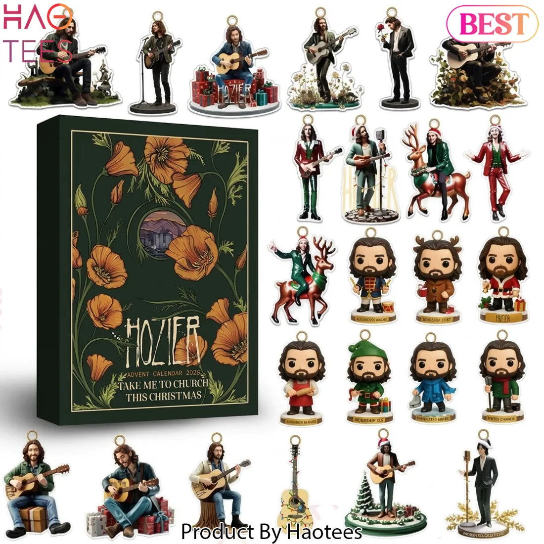
Hozier Take Me To Church This Christmas 2026 Holiday Countdown Advent Calendar

$65.90
Estimated arrival
Nov 10
Nov 14 - Nov 17
Nov 17 - Nov 30

Striking Graphic Details of the Hozier 2026 Advent Calendar
This Hozier 2026 Advent Calendar relies on a high-contrast visual language to define its presence. The graphic execution prioritizes sharp lines and a cohesive color story that anchors the entire collection.
The Visual Anatomy
🔍 Bold Typography
The lettering utilizes a jagged, organic typeface that mirrors the raw energy of the artist. This font choice creates a strong visual weight against the dark, muted background.
🔍 Dynamic Visual Composition
The layout balances intricate botanical illustrations with clean, negative space. This arrangement ensures the central branding remains the focal point while maintaining a sophisticated flow.
🔍 Striking Color Palette
Deep forest greens provide a moody backdrop for the vibrant, warm orange floral accents. This high-contrast pairing creates a striking graphic impact that draws the eye immediately.
Slim & Compact Design: Designed with a space-saving silhouette that stores and displays effortlessly without adding unnecessary bulk.
1. Choose style, color and size.
- The above atributes are always available and suitable for the design, please do not hesitate to choose your favorite product.
- Please see our Size chart to make sure the size is right for you. See details of our product information on our Product information page.
2. Click Add to cart.
- Tip: Buying 2 or more products significantly reduces delivery costs.
3. Go to the checkout page.
- Fill out the order information and proceed with payment.
4. The system will send a confirmation email when the order is complete.
- You can only change the order information within 24 hours of placing an order successfully.
5. If you receive a defective product due to printing or shipping, please contact us to get a new replacement product for free.
If you have any questions, please chat with us or contact us via [email protected]. Your satisfaction is our happiness. Thank you for trusting and shopping with us!
From: Haotees Store
Be the first to review “Hozier Take Me To Church This Christmas 2026 Holiday Countdown Advent Calendar”
Haotees Store







Reviews
There are no reviews yet.